In my last post, I covered the initial reasons for redeveloping the homepage and the discovery work we did. Have a read.
Now I’ll look at how we started to make our initial content decisions, the design phase, and where we’ve reached now with the project.
Analysing our research
As I wrote in the last post, our user experience (UX) team gathered a large amount of data from various user and stakeholder research exercises. It was now time to look through that data to see how it would inform the content of the new homepage.
To do this we ran a research-synthesis workshop, with a ton of post-it notes! Post-its are very common in UX exercises. They help you record, group and order any insights you can extract from your data and provide clear themes for you to work with. Which, as you can see from the photos, is exactly what we did.
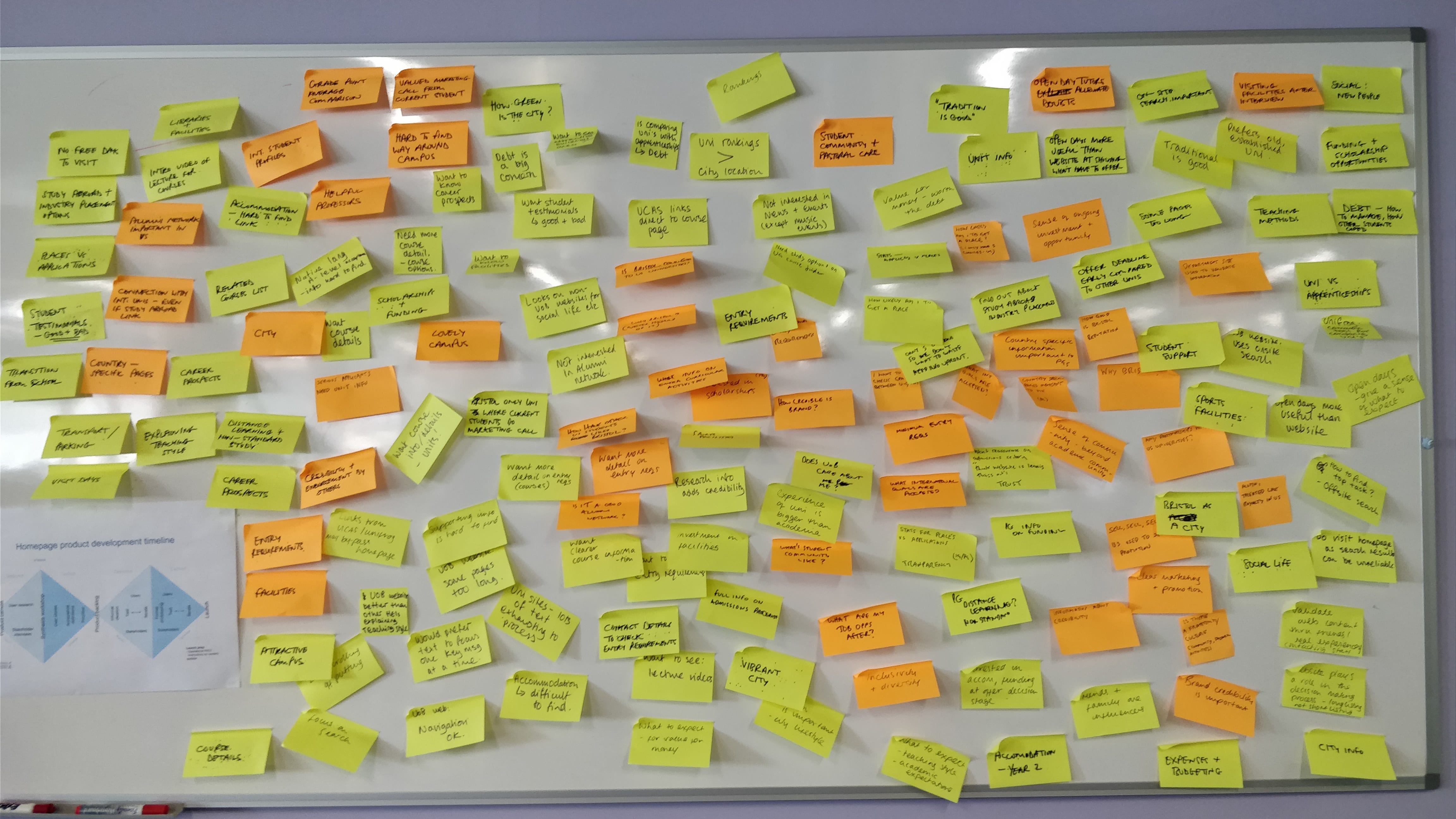
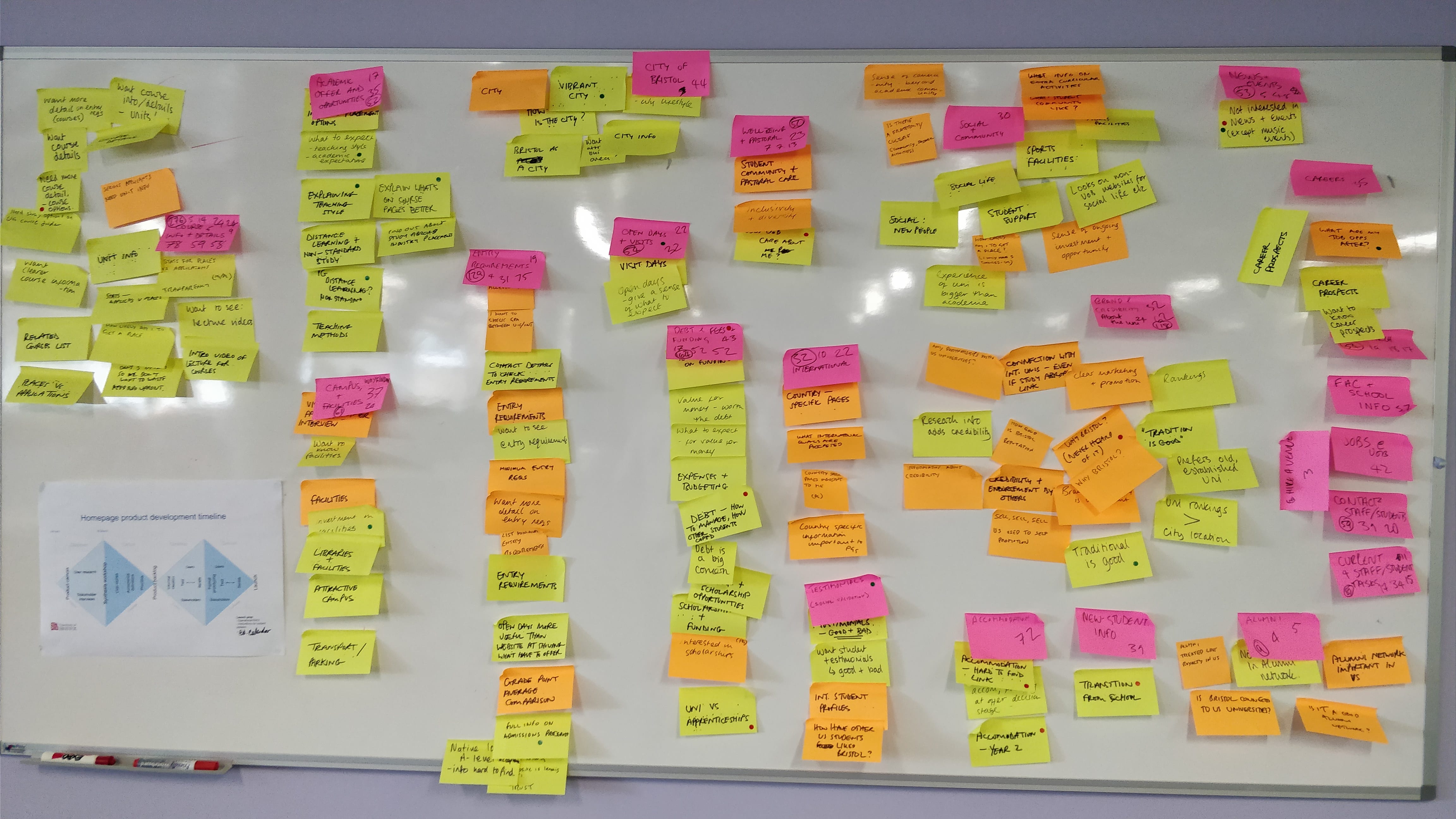
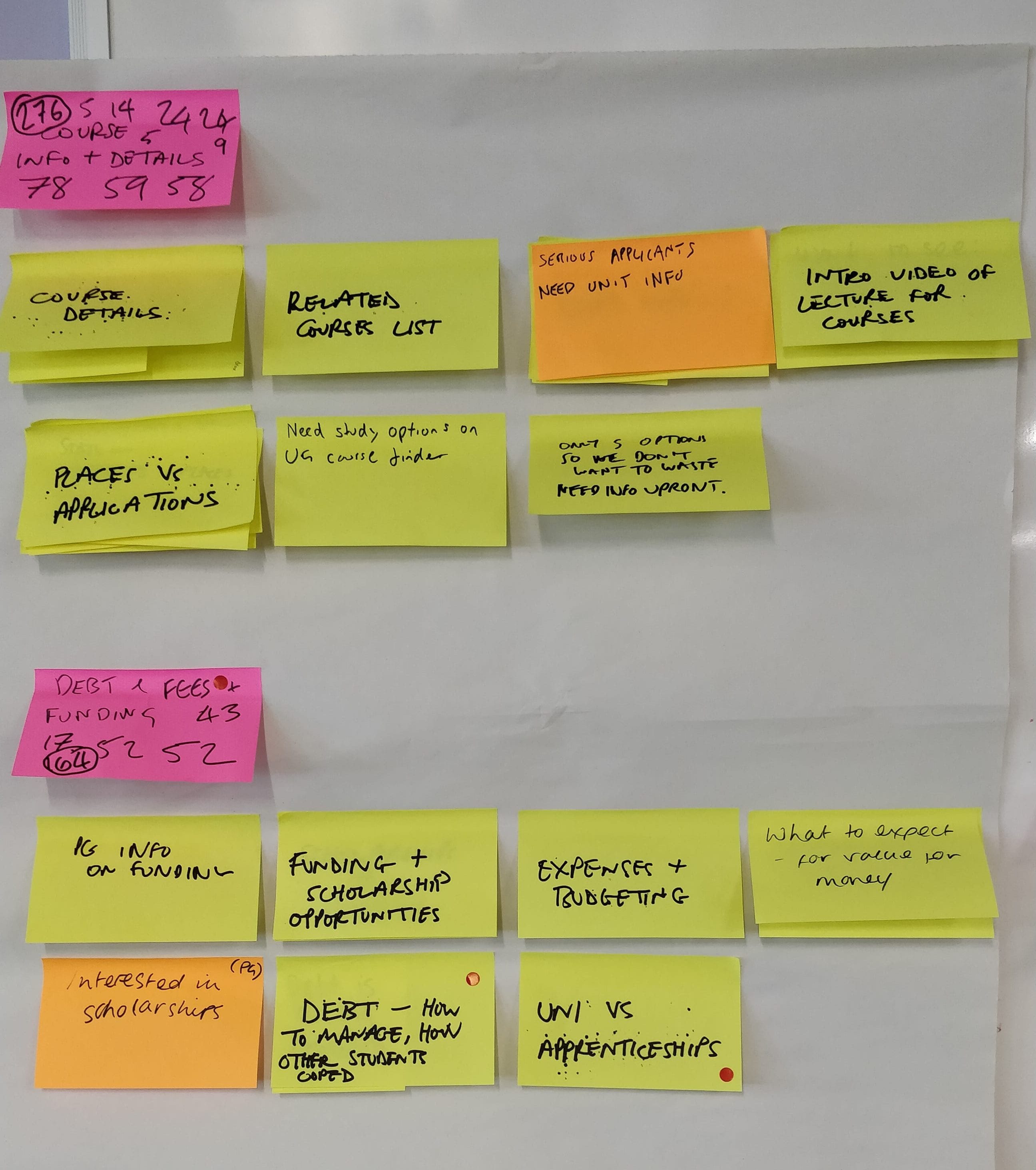
The themes we were identifying were common requirements that our users are looking to complete when they visit the homepage. We also ran a scoring exercise to prioritise these themes based on how often they had come up in the research and how important they were to our users.
On top of this, we’d recorded negative and positive experiences our respondents had when interacting with the University, with our website and with university websites in general. Though not user requirements in themselves, these are useful to help influence the design, tone of voice etc.
We then wrote a job story for each user need, giving us a clear context for each one and an idea of how it would be fulfilled. (More about job stories in brief and more about job stories in detail.)
We now had a prioritised list of job stories on which we could base our content structure. But how to turn this list into something visual?
Co-design wireframes
To kick this process off, I ran a co-design workshop with our designer, devs and UX team. These workshops are a great way to generate a large number of quick, informal design ideas for individual pieces of content that each relate to a user need. Each member of the group sketches out a set number of different treatments within a short timespan. Then the group comes together to vote on ones they think are worth investigating further.
Now we could also visualise some initial wireframes for the page based on the job stories. Content elements for higher scoring stories went towards the top where users would see the content more immediately, lower scoring towards the bottom.

We were now ready to move into a more formal design phase.
Design phase
This is where it started to get really interesting. As I’ve written about before, we’re using an agile approach to this project. This means working on products together in sprints, developing a usable product quickly, releasing as soon as our job stories are met in a basic way, and then iterating a cycle of user-testing and improvements.
So, having pinned down our wireframe and our job stories, we should now be in a position to start building the homepage, with designer and developers working closely together to produce, test and improve, right?
Well… as a product manager I wasn’t confident we could cohesively work on designing and building the individual components of the homepage before we’d had a chance to see a version of the whole thing, if not fully designed then at least drafted, to get a clear visual representation of what we were building.
All the more so as we would be incorporating visual elements from our recent brand refresh. This effectively meant creating a new pattern library. Not everyone in the team agreed but we did all decide to run a design phase before the build phase, mocking up several versions of the designs in Photoshop.

Build phase
The build phase was where I finally brought in our developers to start turning the designs into actual web-page elements. In fact, they’re doing a lot more than that. As I’ve said, we’re designing and implementing a new pattern library based on the University’s new brand identity that could be rolled out across other web content.
But we’re also testing out a new content management system and a new development environment. They’re both using new and advanced front-end technologies that are a lot more sophisticated than our current systems and processes. And, we’re implementing a new way of working by applying established product-management methodologies to our work practices more strictly than before.
We’re using the homepage as the proof-of-concept to test and showcase all these.
I implemented scrum as the preferred agile methodology (there are several) to run the build phase. This splits the phase into distinct, two-week, ‘sprints’ with specific tasks undertaken at the start and end of each sprint as well as daily throughout each one.
For each sprint there is a set list of jobs to complete based on the content components of the homepage (and don’t forget, each component links back to a specific job story). The idea is that you can then plan out how many sprints it will take you to reach the minimum viable product (MVP) – the earliest stage you can launch the product.
Right now we’re just a sprint away from launching our MVP, but using scrum has been extremely valuable in managing the build. From a product manager perspective, it’s allowed me to keep a close eye on progress, and making sure all that progress is tethered to those original job stories. For the team, it’s kept momentum going in a classic higher-education environment where it’s difficult to focus on a single project for any period of time. It’s also helped to keep us all working very closely together and remove blockers quickly.
As a university comms team, we’re relatively new to using scrum and lean agile approaches in our work. Most of these come from software-development industries. Several university digital and other comms teams have started following these approaches in the last few years, but it’s still far from standard.
As our work in digital comms evolves and as new technologies emerge that allow us as content people to take more control over the tech that supports our content, I can see the benefits of following these models to run our projects. All the more so as we get used to running them as standard practice and our experience of fitting them into the running of the content team grows.
In the meantime, watch this space for the new-and-improved University of Bristol homepage!